Platform
Reach Modules
Data Management Module
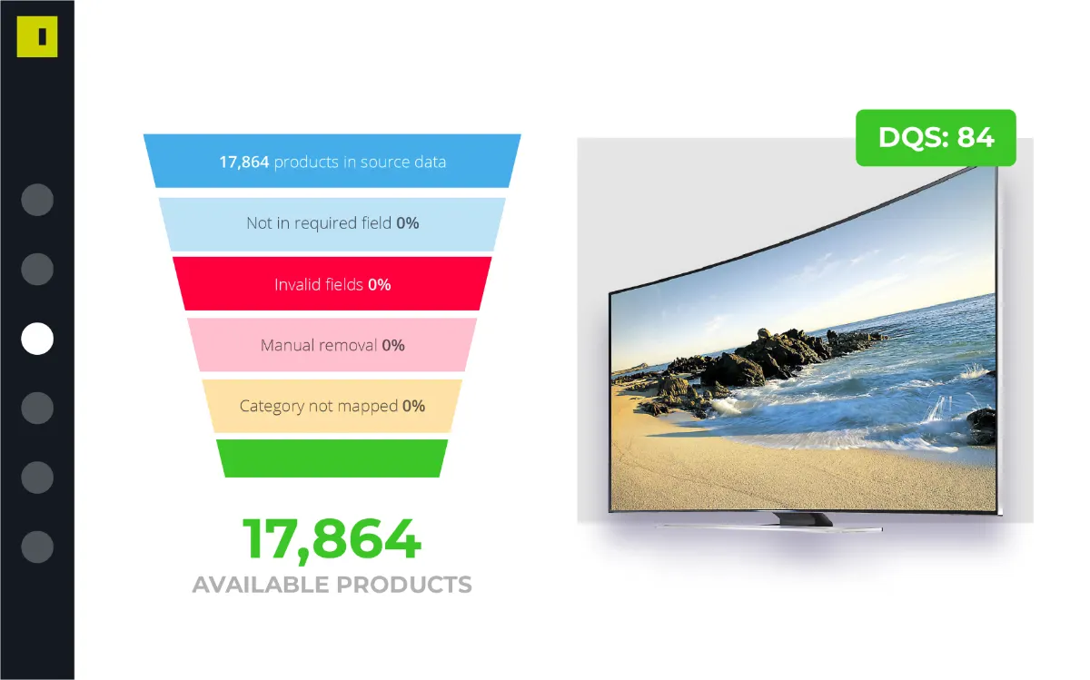
This is the core module of the Intelligent Reach platform. It comprises multiple tools that clean and optimise product data for activation on over 1,500 channels.
Marketplace Module
API connections and feed templates for third party marketplaces and social commerce channels.
Local Module
Use the Local module to drive online traffic to your physical stores. Perfect for BOPIS (Buy Online Purchase In Store) customers.
Book Your Demo
Products not showing on Google Shopping or other important shopping and marketplaces channels?
Book Demo Now
Solutions
Solutions by Role
E-commerce Teams
Make your products into best sellers & build a positive customer experience
Digital Marketers
Get your product ads shining with superior product data feeds
Digital Agencies
Delight your clients with outstanding results and have product data on your side
Solutions by Need
Manage Marketplaces
Syndicate your catalogue to marketplaces, managing inventory and orders, from one platform.
Sell on Marketplaces
Distribute your catalog across global and local marketplaces
Optimise Google Shopping
Make your ads stand out with full Google power at your side
Increase Profitability
Increase revenue and ROAS by extending reach and optimising channels
Drive Online to Offline
Drive shoppers right to your physical stores with your data feed as your ally
Success Stories


Seraphine
How Seraphine achieved a product approval rate of over 99.95%

PrettyLittleThing
Campaign boosts visibility by 1,400% for PRETTYLITTLETHING
Motorpoint
Motorpoint revs up its digital marketing and turbocharges innovation by 50X
Clarins
Clarins cleanse their feed and grow Google Shopping impressions by 185%
Pets at Home
Pets at Home boost their online presence and increase conversions by 95%
River Island
River Island drives Cyber Weekend sales after launching onto Google Shopping

Ego
Ego Shoes make Google Shopping a success with a 85% boost in traffic
DISCOVER GREAT STORIES
Take a sneak peek of how other brands and retailers are working out their e-commerce challenges.
See All Stories
Resources
News
The latest e-commerce news and Intelligent Reach announcements
Guides
Online guides to help you get the most out of our platform
How to Sell on...
Detailed, step-by-step, help articles to boost sales and ROI
Hints & Tips
Quick tips, hints and advice - dip in and learn!
Webinars
Get your coffee ready and enjoy the show
e-Books
Get tips, tricks, insight, and advice in our range of comprehensive e-books
E-commerce Insights
Sign up to E-commerce Insights - our monthly guide to everything that's new in digital product marketing
Sign up to the newsletter
About Us


Book a DemoAbout Us
Find out what makes Intelligent Reach tick...
Our Team
Get to know the team - and the Gifs that sum them up
Our Partners
Plug into our ecosystem and open up a network of sales opportunities
Beyond Customer Success
Get onboard quickly and get ahead of the learning curve
Pricing
Get your customised price tailored to your online selling needs
Join Us
Want a job to complain about? Sorry, we can't help
Get in Touch
With a great platform, great things happen. Get in touch now and don't leave behind any questions
Get in touch now
Platform
Reach Modules
Data Management Module
This is the core module of the Intelligent Reach platform. It comprises multiple tools that clean and optimise product data for activation on over 1,500 channels.
Marketplace Module
API connections and feed templates for third party marketplaces and social commerce channels.
Local Module
Use the Local module to drive online traffic to your physical stores. Perfect for BOPIS (Buy Online Purchase In Store) customers.
Book Your Demo
Products not showing on Google Shopping or other important shopping and marketplaces channels?
Book Demo Now
Solutions
Solutions by Role
E-commerce Teams
Make your products into best sellers & build a positive customer experience
Digital Marketers
Get your product ads shining with superior product data feeds
Digital Agencies
Delight your clients with outstanding results and have product data on your side
Solutions by Need
Manage Marketplaces
Syndicate your catalogue to marketplaces, managing inventory and orders, from one platform.
Sell on Marketplaces
Distribute your catalog across global and local marketplaces
Optimise Google Shopping
Make your ads stand out with full Google power at your side
Increase Profitability
Increase revenue and ROAS by extending reach and optimising channels
Drive Online to Offline
Drive shoppers right to your physical stores with your data feed as your ally
Success Stories


Seraphine
How Seraphine achieved a product approval rate of over 99.95%

PrettyLittleThing
Campaign boosts visibility by 1,400% for PRETTYLITTLETHING
Motorpoint
Motorpoint revs up its digital marketing and turbocharges innovation by 50X
Clarins
Clarins cleanse their feed and grow Google Shopping impressions by 185%
Pets at Home
Pets at Home boost their online presence and increase conversions by 95%
River Island
River Island drives Cyber Weekend sales after launching onto Google Shopping

Ego
Ego Shoes make Google Shopping a success with a 85% boost in traffic
DISCOVER GREAT STORIES
Take a sneak peek of how other brands and retailers are working out their e-commerce challenges.
See All Stories
Resources
News
The latest e-commerce news and Intelligent Reach announcements
Guides
Online guides to help you get the most out of our platform
How to Sell on...
Detailed, step-by-step, help articles to boost sales and ROI
Hints & Tips
Quick tips, hints and advice - dip in and learn!
Webinars
Get your coffee ready and enjoy the show
e-Books
Get tips, tricks, insight, and advice in our range of comprehensive e-books
E-commerce Insights
Sign up to E-commerce Insights - our monthly guide to everything that's new in digital product marketing
Sign up to the newsletter
About Us


Book a DemoAbout Us
Find out what makes Intelligent Reach tick...
Our Team
Get to know the team - and the Gifs that sum them up
Our Partners
Plug into our ecosystem and open up a network of sales opportunities
Beyond Customer Success
Get onboard quickly and get ahead of the learning curve
Pricing
Get your customised price tailored to your online selling needs
Join Us
Want a job to complain about? Sorry, we can't help
Get in Touch
With a great platform, great things happen. Get in touch now and don't leave behind any questions
Get in touch now
Platform
Reach Modules
Data Management Module
This is the core module of the Intelligent Reach platform. It comprises multiple tools that clean and optimise product data for activation on over 1,500 channels.
Marketplace Module
API connections and feed templates for third party marketplaces and social commerce channels.
Local Module
Use the Local module to drive online traffic to your physical stores. Perfect for BOPIS (Buy Online Purchase In Store) customers.
Book Your Demo
Products not showing on Google Shopping or other important shopping and marketplaces channels?
Book Demo Now
Solutions
Solutions by Role
E-commerce Teams
Make your products into best sellers & build a positive customer experience
Digital Marketers
Get your product ads shining with superior product data feeds
Digital Agencies
Delight your clients with outstanding results and have product data on your side
Solutions by Need
Manage Marketplaces
Syndicate your catalogue to marketplaces, managing inventory and orders, from one platform.
Sell on Marketplaces
Distribute your catalog across global and local marketplaces
Optimise Google Shopping
Make your ads stand out with full Google power at your side
Increase Profitability
Increase revenue and ROAS by extending reach and optimising channels
Drive Online to Offline
Drive shoppers right to your physical stores with your data feed as your ally
Success Stories


Seraphine
How Seraphine achieved a product approval rate of over 99.95%

PrettyLittleThing
Campaign boosts visibility by 1,400% for PRETTYLITTLETHING
Motorpoint
Motorpoint revs up its digital marketing and turbocharges innovation by 50X
Clarins
Clarins cleanse their feed and grow Google Shopping impressions by 185%
Pets at Home
Pets at Home boost their online presence and increase conversions by 95%
River Island
River Island drives Cyber Weekend sales after launching onto Google Shopping

Ego
Ego Shoes make Google Shopping a success with a 85% boost in traffic
DISCOVER GREAT STORIES
Take a sneak peek of how other brands and retailers are working out their e-commerce challenges.
See All Stories
Resources
News
The latest e-commerce news and Intelligent Reach announcements
Guides
Online guides to help you get the most out of our platform
How to Sell on...
Detailed, step-by-step, help articles to boost sales and ROI
Hints & Tips
Quick tips, hints and advice - dip in and learn!
Webinars
Get your coffee ready and enjoy the show
e-Books
Get tips, tricks, insight, and advice in our range of comprehensive e-books
E-commerce Insights
Sign up to E-commerce Insights - our monthly guide to everything that's new in digital product marketing
Sign up to the newsletter
About Us


Book a DemoAbout Us
Find out what makes Intelligent Reach tick...
Our Team
Get to know the team - and the Gifs that sum them up
Our Partners
Plug into our ecosystem and open up a network of sales opportunities
Beyond Customer Success
Get onboard quickly and get ahead of the learning curve
Pricing
Get your customised price tailored to your online selling needs
Join Us
Want a job to complain about? Sorry, we can't help
Get in Touch
With a great platform, great things happen. Get in touch now and don't leave behind any questions
Get in touch now


 River Island